When a design problem is severely constrained it becomes possible to generate all solutions to the problem. That is, it is possible to close out the problem.
In the late 1960s and early 1970s the design of British Local Authority 2 and 3 story house types became so severely constrained that it became feasible to think about generating all possible house type designs.
Three different groups became involved with this endeavour: the National Building Agency (NBA), the Scottish Special Housing Association (SSHA) in collaboration with the Edinburgh University Architecture Research Unit (ARU) and the University of Cambridge Land Use and Built Form Studies Group.
The Ministry of Housing and Local Government Circular 36/69 brought together and modified a number of important earlier pieces of work. (MoHLG 1969a)
It made the minimum whole house Parker Morris space standards into de-facto maxima. (MoHLG 1961)
It also introduced lists of furniture, from Design Bulletin 6: Space in the Home (MoHLG 1963), which had to be accommodated in each type of room.
Design Bulletin 16: Dimensional Coordination in Housing (MoHLG 1969b) also made 300mm external and 100mm internal planning grids and 2600mm floor-to-floor heights mandatory; the latter enabling the plan size of vertical elements like stairs to be standardised.
It soon became apparent to people designing house types that the task was becoming so severely constrained that it was very difficult or impossible to design certain house types without breaking one or more of these rules.
Generic House Types
In the late 1960s the National Building Agency (NBA) was concerned about low house building productivity. The NBA attempted to close the problem out by generating an array of all possible house types with 300mm increment shell sizes that met Circular 36/69 requirements and then proposed a reduced set that would give additional productivity gains to contractors. (National Building Agency, 1965).

Unfortunately later research by the Building Research Establishment (BRE) showed that the shell was not the main determinant of house building productivity. The initiative was not widely taken up and had very little effect, although the tools developed in the effort were sometimes used by others.
SSHA / ARU House Design Program
The Scottish Special Housing Association (SSHA) and the Edinburgh University Architectural Research Unit (ARU) took a different approach and developed a Computer Aided Design program, called House Design. (Bijl et al 1971)
This allowed experienced designers to interactively design house types within Circular 36/69 restraints, which had already been incorporated, with some minor variations, into the Scottish Building Regulations.
All location, component and assembly drawings and bills of quantities were then automatically produced, without any further interaction, by reference to a complete set of standard component and assembly details. That is all possible assembly details had been identified, detailed and quantified in advance of their being required.
Design Bulletin 16 recommended (probably required) that internal components be located with one of their finished faces on a 100mm grid line. Somewhat surprisingly it was thought that this would aid the location of components on site.
However it greatly increased the number of possible assembly details that were required. The enumerative analysis that follows was used to justify locating interior components symmetrically within their grid space rather than face-on-grid.
The diagram below shows all the possible ways internal components can meet when they are located symmetrically within a grid. The numbers in brackets indicate the number of ways that components in that configuration can meet if they are located face on grid.

The following diagram shows the ways the components of the circled arrangement can meet when the components are located with their faces on grid.

In House Design the components were either a load bearing partition (structurally 74mm wide) , a non-load bearing partition (structurally 50mm wide) or an internal door. Giving a requirement for a library of the following assembly details.

In summary, locating internal components symmetrically within their grid space reduces the number of assembly details required by a factor of almost 8 and avoids the need for lots of otherwise very similar and potentially confusing details.
Locating internal components centrally in their 100mm grid space meant that location plans could be automatically dimensioned, with dimensions to the structural face of the components; that is before plasterboard etc were applied and exactly as site operatives handled them. This had the added advantage that grids could be ignored on site; their work having been done in organising the system, they were no longer needed.

SSHA Automatically Dimensioned House Type Plan
Automatic Generation of Minimum Standard House Plans
The paper The Automatic Generation of Minimum Standard House Plans, (Steadman 1970) proposed a more fundamental method of generating all possible minimum standard house plans. As Steadman put it:
“it would be possible – given requirements for minimum sizes for rooms and constraints on the permissible shapes they might take, as well as ‘adjacency requirements’ – to produce quite systematically all possible plans in which those requirements were satisfied.”
The intention of this study was therefore to systematically generate all possible standard house plans.
It follows a method used to find squares composed of smaller unique sized squares, using Graph Theory and Kirchhoff’s Laws for electrical flow in wires. (Tutte, 1958).

The diagrams below show how a plan can be represented as a graph. The graph below shows the vertical distribution of the room dimensions in the plan. A similar graph, usually the dual of this, can be produced for the horizontal distribution.
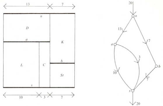
The distance from the bottom edge of the plan is added to each node of the graph (circled below)

The ‘current’ in the Kitchen ‘wire’ is its horizontal dimension 7. The ‘voltage’ at the two ends of the wire are 21 and 7. Their difference is 14 which is the vertical dimension of the room.

In spite of the NBA having earlier produced minimum room layouts for all room types (see bedroom example below) this interesting proposal seems never to have been implemented.

Further work on this idea was reported in Synthesis and Optimization of Small Rectangular Floor Plans (Mitchell, Steadman and Ligett 1976), and this went a long way to explaining why this interesting method was not implemented.
Synthesis and Optimization of Small Rectangular Floor Plans
The analysis in this paper is based on the dimensionless dissection of a rectangle into n parts, the assignment of room names to the parts and then satisfying adjacency requirements between rooms.

The number of possible dissections grows exponentially with the number of rectangles, as illustrated below for 1 to 8 rectangles.

But for 9 rectangles it was estimated that there were approximately 25000 possible dissections. A future post will show how this figure can be accurately calculated.
Most realistic house types have 8 or more spaces (rectangles) per floor as exemplified by the SSHA house type plan shown above. The requirement for doors to be only in certain restrained locations also means that further transition-spaces would be needed.
There also seemed to be difficulties in reconciling adjacency and dissections graphs.
Whilst stating that the method is easily extended to multi-storey buildings the only examples given are of single storey trailer designs.
This leaves a catalogue of the bisections of a rectangle into 2 to 6 rooms.
 That is a list of dissections unsuitable for generating most house types.
Conclusions
The Ministry of Housing and Local Government Circular 36/69 unintentionally brought together all the requirements for the design of 2 and 3 storey local authority house types to be automated.
Most importantly this included the adoption of Parker Morris space standards as de-facto maxima, the requirement for particular room types to be able to accommodate standard lists of fixed sized furniture and the mandatory imposition of dimensional coordination.
The National Housing Agency Generic House Types were manually produced. The furniture lists of Circular 36/69 were built up into collections of minimum sized rooms (as in bedroom example above). These in turn were assembled into the house types. However a desire to exactly match Parker Morris space standards, particularly the complex storage requirements often lead to the integrity of the shell being violated as shown below.
 And as mentioned earlier, later research by BRE showed that the shell was not the main determinant of house building productivity.
Based on its complete set of assembly details, the Scottish Special Housing Association / Edinburgh University ARU House Design Program became a fully operational system that automatically produced all location, component and assembly drawings and bills of quantities from interactive screen based input. Its demise came about through the Thatcher Government abandoning Parker Morris space standards and Local Authority house building in general.
The University of Cambridge Land Use and Built Form Studies perhaps more intellectually ambitious Automatic Generation of Minimum Standard House Plans never became a working system. This was probably because they had no one with experience of actually having designed house types and apparently did not know of the work done by the NBA. Even working at the MoHLG R+D Group we had to obtain their minimum room layouts surreptitiously. But more importantly they had no way of dealing with the explosion of intermediate and preliminary results their method required. A problem that will be addressed in later posts.
Bibliography
Bijl, A., Renshaw, T., Barnard, D. et al., 1971. ARU research project A25/SSHA-DOE: house design ; application of computer graphics to architectural practice
Mitchell, W.J., Steadman, J.P. & Liggett, R.S., 1976. Synthesis and optimization of small rectangular floor plans. Environment and Planning B Planning and Design, 3(1), pp.37 – 70.
MoHLG, 1969a. Circular 36/69. London: Her Majesty’s Stationary Office.
MoHLG, 1963. Design Bulletin 6 Space in the Home. London: Her Majesty’s Stationary Office.
MoHLG, 1969b. Design Bulletin 16 Dimensional Coordination in Housing. London: Her Majesty’s Stationary Office.
MoHLG, 1961. Homes for Today and Tomorrow (The Parker Morris Report). London: Her Majesty’s Stationery Office.
National Building Agency, 1965. Generic Plans: Two and Three Storey Houses London: The National Building Agency
Steadman, P., 1970. The Automatic Generation of Minimum Standard House Plans Working Paper 23 University of Cambridge Land Use and Built Form Studies
Tutte, W. T., 1958. Squaring the Square from ‘Mathematical Games’ column, Scientific American Nov 1958.