The co-inventor of the bar code N. J0seph Woodland died recently; his other co-inventor, Bernard Silver, having already died in 1963 aged just 38. They had been inspired by Silver overhearing the president of a food chain pleading with one of the deans of Drexel Institute of Technology to undertake research on capturing product information automatically at the checkout and the dean turning the request down.
Their patent was filed in 1949 and accepted in 1951, it included a means of optically reading the codes by moving the target and the reading device relative to each other.
Creation Myth
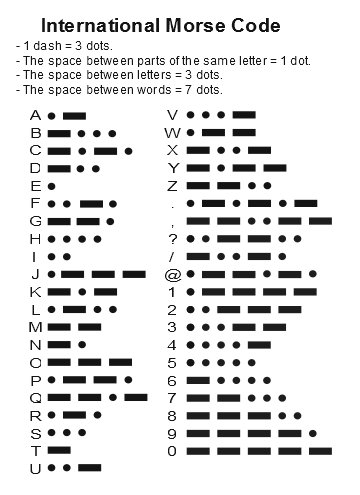
In 2004 Woodlands remembered how the idea came to him having learnt Morse Code as a Boy Scout: “I was sitting in a beach chair. I stuck my fingers in the sand, and I drew my hand to me. I left three or four furrows in the sand. I said, ‘Wow. I could have wide lines and narrow lines [instead of dots and dashes].’ That was the invention. It sounds too simple, doesn’t it?”.
Coding
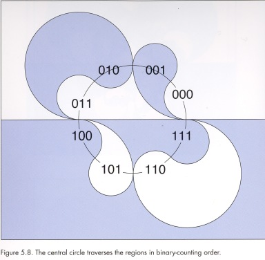
FIG 1 above shows a pattern of white lines numbered 1-4 on a black background 5. Line 1 is a datum line and lines 2, 3 and 4 are in fixed positions with respect to it. There are then fixed places for lines 2, 3 and 4 in the pattern and these are termed information lines. While lines 2, 3 and 4 have fixed places, these places do not need to be filled; for instance, in FIG 3 line 4 is missing. A zero (0) is associated with missing lines and the number 1 (1) with occupied lines. The information pattern in FIG 3 could therefore be replaced by the code number 110 and the pattern of FIG 4 by 101. These codes can be interpreted as binary codes as follows line where line 4 -> 20 = 1, line 3 -> 21 = 2 and line 2 -> 22 = 4.
FIG 3 -> 110 = 22 + 21 = 4 + 2 = 6
FIG 4 -> 101 = 22 + 20 = 4 + 1 = 5
The circular, target style, bar code illustrated in the patent application shows how Woodlands and Silver were concerned about how the code would needed to be read from any direction.
Classifying or Labelling?
It is strange that the system is described as a classification system rather than a labelling or coding system. This might best be illustrated by imaginging using the system to label two dissimilar items with the same code, or alternatively labelling two similar items with different codes. Classification is to do with identifying similarity and difference and labelling to do with marking or coding that similarity or difference.
In 1962 Woodlands and Silver sold their patents rights to Philco who sold the rights onto RCA and Woodlands went to work for IBM where he hoped to promote the idea.
KarTrak System
The railroad industry had a pressing need to track freight wagons. The KarTrak system developed by David J. Collins and the Sylvania Corporation used 2 part bands, each part of which was orange, blue or checkerboard, to represent the numbers 0 to 10 which were identified by shining coloured light onto the bands using a trackside reader. Collins wanted to produce a black and white version but was balked and left Sylvania to found Computer Identics Corporation.
The KarTrak two bar coding system; the parity bit is either 10 as shown or 0.
Readers
These early systems all suffered from the difficulty of producing efficient, compact and cost effective readers. Woodland and Silver’s first reader used a 500w incandescent bulb and a photo-multiplier tube, designed for movie sound systems. It was the size of a desk and needed to be shaded from ambient light. The expensive computers needed for the KarTrak system eventually saw its discontinuation after a successful initial introduction.
Eventual Success
RCA continued the development of the target shaped system for retail use and the crowds it attracted at a trade fair, running a competition, rekindled IBM’s interest; who then realised that Woodland was one of their employees. But the advent of cheap lasers and computers would be necessary for the triumph of the now ubiquitous barcode; with many different applications being championed by David J. Collins.
Architectural “Applications”
Bar coding eventually seeped through to architecture in sometimes charming ways.
Bar code building by Jan Timm.
QR Codes
The cherry on the cake was the ability of smart phones to act as readers with orientation being ensured by 3 large corner symbols (4.1 below) with a deliberately smaller 4th corner symbol (4.2 below)
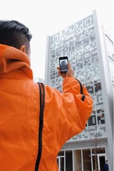
The N building in Tokyo, Japan is an apparently Augmented Reality project by Terradesign and Qosomo. Passersby can point their mobile devices at the building and find out what is going on inside. The building frame supplies the necessary quiet zone (5. above)
This is an extract fromThe Page the first essay in Georges Perec’s Species of Spaces and Other Pieces, Perec (1974, 1997).
“This is how space begins, with words only, signs traced on the blank page. To describe space: to name it, to trace it, like those portolano-makers who saturated the coastlines with the names of harbours, the names of capes, the names of inlets, until in the end the land was only separated from the sea by a continuous ribbon of text. Is the aleph, that place in Borges from which the entire world is visible simultaneously, anything other than an alphabet? Space as inventory, space as invention. Space begins with that model map in the old editions of the Petit Larousse Illustré, which used to represent something like 65 geographical terms in 60 sq. cm., miraculously brought together, deliberately abstract. Here is the desert, with its oasis, its wadi and its salt lake, here are the spring and the stream, the mountain torrent, the canal, the confluence, the river,……”
This is the illustration Perec is referring to.
The original is really small, only 6 x 10 cm, yet within this tiny area a complete field of interest (Géographie) is enumerated with labels and graphical representations tightly bound together. For instance the label Isthme is right next to its graphical representation and in a wholly natural relation to a Péninsule. In addition all the graphical representations are connected and arranged so as to form a plausible map.
As such it is a member of a very limited class of object, one that as far as I know does not have a name. Following Perec’s alphabetic suggestions, it seems appropriate to call this class of object a visual pangram.
Pangrams use every letter of the alphabet at least once in a more or less meaningful sentence, for instance: –
Jackdaws love my big sphinx of quartz
This includes all 26 letters of the alphabet and has 5 reuses of letters (a twice, s, i and o).
The suggested formulation is;-
that alphabet corresponds to an enumeration of a field of interest
and sentence to a pictorial representation of that field.
A Portolano Map
As noted in the Perec extract above, in a portolano map the text threatens to overrun the graphical image (the coastline) as in this 14th century portolano style map of the Mediteranean.
Anonymous nautical chart in portolan style probably drawn in Genoa
c. 1320-1350.Library of Congress
The Aleph and the Successive Nature of Language
Aleph is the first letter of the Hebrew alphabet and the first letter of the Hebrew word for infinity. Aleph numbers are therefore used to indicate the cardinality (the size) of infinite sets starting with the smallest Aleph-null. Hence the title of the Borges story is The Aleph.
“How, then, can I translate into words the limitless Aleph, which my floundering mind can scarcely encompass? Mystics, faced with the same problem, fall back on symbols: to signify the godhead, one Persian speaks of a bird that somehow is all birds; Alanus de Insulis, of a sphere whose center is everywhere and circumference is nowhere; Ezekiel, of a four-faced angel who at one and the same time moves east and west, north and south. (Not in vain do I recall these inconceivable analogies; they bear some relation to the Aleph.)
Perhaps the gods might grant me a similar metaphor, but then this account would become contaminated by literature, by fiction. Really, what I want to do is impossible, for any listing of an endless series is doomed to be infinitesimal.
In that single gigantic instant I saw millions of acts both delightful and awful; not one of them occupied the same point in space, without overlapping or transparency. What my eyes beheld was simultaneous, but what I shall now write down will be successive, because language is successive. Nonetheless, I’ll try to recollect what I can.”
Text and Image
In the portolano map the text overpowers the graphical image (the coastline).
In the Aleph story, an infinite and all pervading moving image – a premonition of multi-channel television or the internet perhaps, seriously distracts the author and prevents him from writing; a state of affairs that is only resolved by the writer demolishing his house and filling the basement, where the Aleph resides, with concrete.
But in the Petit Larousse Illustré map, and in visual pangrams in general, image and text are simultaneous and reinforce each other, without either threatening to dominate the other.
Aiding Memory
There is some evidence that sequential and visual information are processed in different ways, and that recall is better with a combination of text and image. Mental Representations A Dual Coding Approach. Paivio (1990).
Indeed in Species of Spaces Perec is remembering, in a piece he wrote in the 1970s, something he must have read and seen as a child in the 1940s.
Making a Visual Argument
This visual pangram attempts to show how John Soane’s architecture is related to (and is distinct from) all other architectural styles.
It represents the styles of architecture as a park one can walk round; inspecting buildings of MAHOMEDAN POINTED, CHRISTIAN POINTED, GOTHIC etc. styles. Each style is enclosed in its own fenced off area and labelled in an uppercase sans-serif typeface then a new re-invention, described in TheNymph and the Grot, Mosley (1969).
There is a straight path from the park gate to the Palace of Architecture. The Soanean building is nearest to the Palace of Architecture in the Greco-Roman section, with its own path to the Palace but carefully screened and separated from the Gothic. The Egyptian section also has its own path but all the other styles are accessed from meandering paths that branch off from the main route to the Palace of Architecture.
A visual pangram is being used to help make a visual argument.
An Indexed Visual Pangram
This image forms the front endpaper and frontispiece of the Third Edition of A Field Guide to the Birds of Britain and Europe and shows the birds one is most likely to see in the places where they are most likely to be seen (from top to bottom) on telephone wires, in trees, on fence posts or on the ground. Peterson, Mountford, and Hollom (1974).
The indexing tidies up the overall pictorial image but gives prominence to the individual graphical representations at the expense of the labels. This is emphasised somewhat by the skylark silhouette being allowed to overlap the text panel. It also imposes an arbitrary, if accidental, linear order on the overall image; top-left to bottom-right, 1 to 20, BEE-EATER to ROOK.
Visual List or Confection: Pugin’s Churches
Edward Tufte used this image as an example of what he called a visual list or confection. It is the frontispiece of Pugin’s An Apology for The Revival of Christian Architecture in England. Pugin (1843).
It shows St Giles Cheadle in the centre surrounded by other Pugin projects (some of them never completed).
Many other examples of visual lists or confections are also frontispieces that act as visual indexes and otherwise advertise a book’s contents.
The image above does in fact contain minute unreadable index numbers.
These refer to a list of the illustrated churches but the list is conveniently located some six pages into the book.
Advertisement: John Soane’s Models
This 1818 rendering by Joseph Michael Gandy is over modestly titled Perspective of various designs for public and private buildings executed by John Soane between 1780 and 1815, shown as if they were models in a gallery.
The image was used as the front and back endpapers of Gillian Darley’s John Soane: An Accidental Romantic. Darley (1990)
There is no attempt to label or index any of the models and as with the Pugin etching, this wonderful rendering is more advertisement than useful reference or thinking tool.
Interactive Visual Pangram
This is an example of a visual pangram being used as an interface to the planning regulations.
Interesting to think how this might be done with a ‘modern’ house; would it, could it, mean as much?
Bibliography
Perec, G. (1974 / 1997). Espèces d’espaces (Species of Spaces and Other Pieces).
(Sturrock, J., Trans.) Paris: Galilée / Penguin.
Borges, J.L. (1947). El Aleph (Di Giovanni, N. T., Trans with author)
Larousse. (1912). Petit Larousse Illustré; Librairie. Paris: Larousse.
Paivio, A. (1990) Mental Representations A Dual Coding Approach. Oxford
Peterson, R., Mountford, G and P. A. D. Hollom, P. A. D. (1974)
A Field Guide to the Birds of Britain and Europe Third Edition; Collins
Wightwick, G. (1840) The Palace of Architecture (‘a romance of art and history’) The Gentleman’s Magazine
Mosley, J. (1965). The Nymph and the Grot St Bride Library.
http://typefoundry.blogspot.com/2007/01/nymph-and-grot-update.html
Gandy J. M. (1818) Perspective of various designs for public and private buildings executed by John Soane
between 1780 and 1815, shown as if they were models in a gallery
Darley, G. (1999) JOHN SOANE: an accidental romantic Yale University Press
Pugin A.W.N. (1843) An Apology for The Revival of Christian Architecture in England. London
Tufte, E. R. (1997) Visual Explanations Images and Quantities, Evidence and Narrative Graphics Press, Cheshire Conn.
Andre Cassagnes the inventor of Etch A Sketch died at the weekend. Etch A Sketch is an ingenious analogue device, that paradoxically makes sketching more difficult yet has sold over 100 million copies since 1960.
Some of its charm must come from the pleasure to be had from acquiring the skills necessary to do something difficult; of mastering a device.
Etch A Sketch self consciously imitates a TV screen and in some ways was a precursor to the Visual Display units that were beginning to be used with early CAD systems.
These were specialist devices, used Cathode Ray Tubes (CRTs) and had a separate processor that continuously drove a beam round the screen to create an image. One of the ones I first used in Edinburgh even had a round radar like monitor and a lightpen. The screen image could be easily changed, have parts added or removed, but would begin to flicker when the image became at all complicated.
This was initially overcome by the use of Storage Tube devices. In these a steerable beam left a trace on the screen very like an Etch A Sketch. Adding to an image was straight forward but deleting was more difficult. The whole screen had to be erased, like shaking the Etch A Sketch, and the image recreated from scratch, often from a separately maintained display list.
A year-out student Tom Kirby emailed an office of 200 people asking what the convention was for beyond and behind dotted line styles. No one knew. On-line searches didn’t prove very helpful so in one of those mad delightful collective moments it was decided to use Morse Code line styles. We would then be able to put any message we liked as a line, including beyond and behind or the scatological, and no one would be any the wiser.
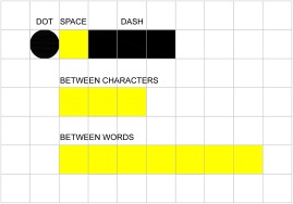
Note that there are really 3 symbols here, a dot, a dash and a space. The definition of the space between characters and the space between words are also important in defining what is in some ways a modular system.
In AutoCAD line type definitions like this should work (followed by 7 spaces).
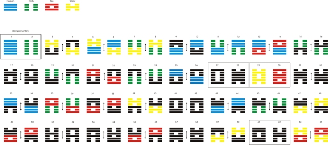
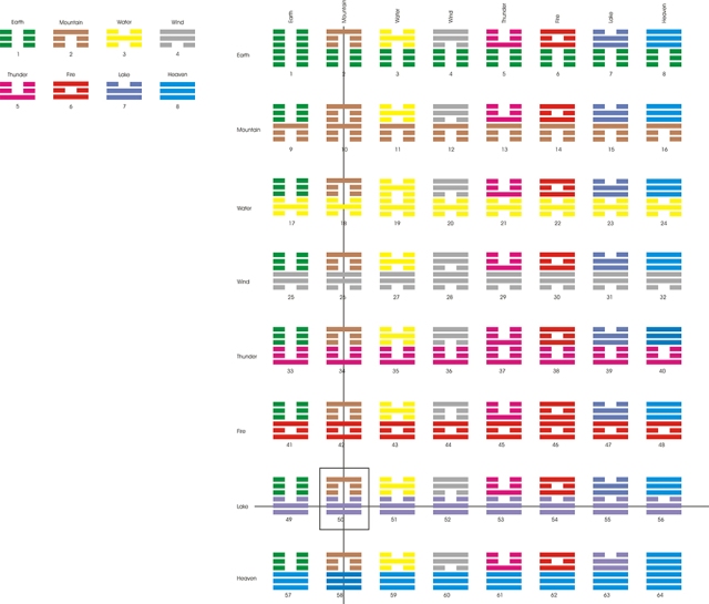
The I Ching consists essentially of 64 chapters with each chapter symbolised by a hexagram formed of six lines each of which is either – – (yin) or – (yang) giving 26 = 64 alternatives. These can be arranged in a number of ways. (Knuth 2005)
The first arrangement is the King Wen Arrangement (c 1100 B.C.). King Wen is apparently a fairly loose period just meaning a very long time ago.
4 symmetric half hexagram symbols are recognised: Heaven, Earth, Fire and Water.
In this arrangement top-to-bottom mirror images (yin yang) are adjacent (odd and even numbers) and other important (same symbol and symmetrical) combinations are in prominent positions (boxed below), otherwise mathematically unsophisticated.
In the Shao Yung Arrangement (A.D. 1060)
4 extra asymmetric half hexagrams are recognised: Mountain, Wind, Thunder and Lake.
Each of 8 half hexagram symbols index both columns (above) and rows (below). Giving 8×8 = 64 combinations again.
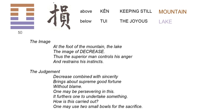
For instance Mountain (column 2) above Lake (row 7) gives chapter 2 + (7 – 1) * 8 = 50
This makes a much more practical index for a book and facilitates divination of various sorts. This calculation method was known at the time.
This method, which is less useful, was not known at the time.
So one might pick 2 sets of 3 long or short sticks and get the following result. 1 long and 2 short (Mountain) followed by 1 short and 2 long (Lake) and then go straight to chapter 50 for a reading.
Chapter 50 Extract
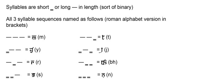
Sanskrit Poetics (c 2nd Century BCE)
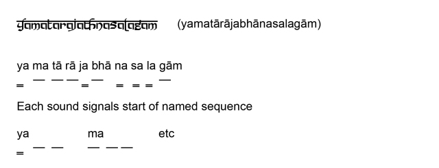
A mnemonic for remembering all sequences developed in the Middle Ages:
Pingala classified all the 16 different meters of four syllables like this:
1 meter of four short syllables SSSS
4 meters of three shorts SSSL, SSLS, SLSS, LSSS
6 meters of two shorts LLSS, LSSL, SSLL, SLLS, LSLS, SLSL
4 meters of one short SLLL, LSLL, LLSL, LLLS
1 meter of no shorts LLLL
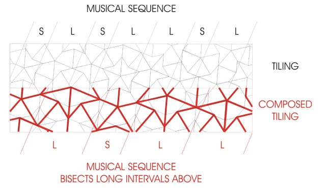
Musical Sequences and Aperiodic Tiling
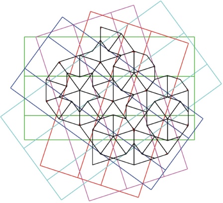
Taking a Penrose P2 (Kite and Dart) aperiodic tiling marked with Ammann bars leads to a set of 5 grids at 2PI/5 rotations.
Spacing between adjacent Ammann lines, short and long intervals, is in the golden ratio. Further short cannot be followed by short and two longs cannot be followed by another long as summarised in the following decision diagram.
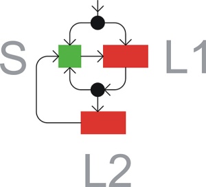
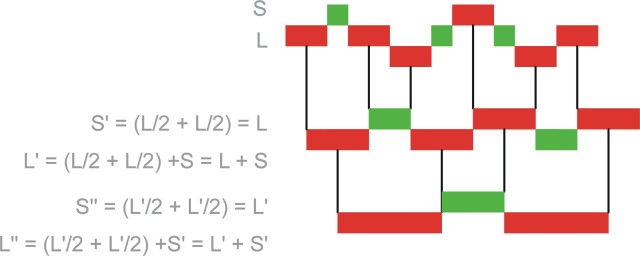
Composing or decomposing a musical sequence gives rise to another musical sequence and an inflated or deflated tiling.
The substitution S’=L” and L’=S+L automatically give rise to the golden ratio
Bibliography
Knuth, D. E., 2005,
The Art of Computer Programming, Volume 4, Fascicle 2: Generationg All Tuples and Permutations
Addison-Wesley
Knuth, D. E., 2006,
The Art of Computer Programming Volume 4, Fascicle 4 Generating All Trees, History of Combinatorial Generation.
Addison-Wesley
Grünbaum, B. & Shephard, G.C., 1987. Tilings and patterns
Freeman
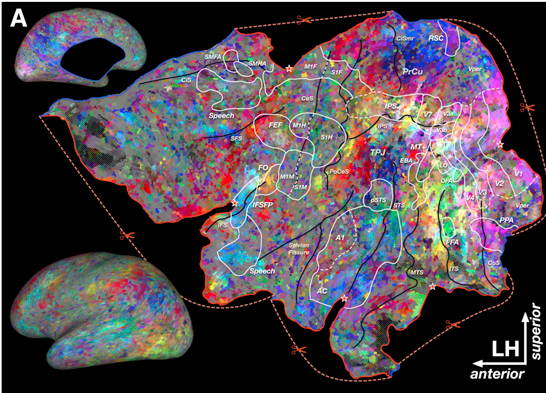
I came across a report of this recently in the New Scientist and thought it might be important as it seems to suggest that the brain locations of names of objects and actions have some commonality across the brains of a range of different people.
The full text of the article from Neuron
“A Continuous Semantic Space Describes the Representation of Thousands of Object and Action Categories across the Human Brain”
There is also an interactive tool that uses WebGL which can be activated on Macs with Snow Leopard and above, but it is much easier just to load Chrome for Mac. WebGL is said to run much faster on Chrome anyway, http://gallantlab.org/semanticmovies/
Bibliography
Huth A.G., Nishimoto S., Vu A.T., Gallant J.L.
“A Continuous Semantic Space Describes the Representation of Thousands of Object and Action Categories across the Human Brain”
Neuron Volume 76, Issue 6, 20 December 2012, Pages 1210–1224
This came about after visiting Loch Maddy in North Uist and trying to think of ways to emulate the strange way that the land and sea merge into each other there and realising that the technique had wider uses as well.
Random Graduated Mixing of Two Elements
The random mixing of two elements can be simply implemented using the random number function in any spreadsheet type program. The essential feature is to compare the output of the random number function RAND() to different trigger values.
RAND() returns a random number between 0.0 and 1.0. Therefore testing if RAND() is less than 0.5 has a 50% chance of being TRUE and a 50% chance of being FALSE. Similarly testing if RAND() is less than 0.25 has a 25% chance of being TRUE and a 75% chance of being FALSE.
The first diagram is taken directly from an Excel spreadsheet. An even set of values is set up for each column, ranging from VALUE = 0.0 for solid land at the left-hand end, to VALUE = 1.0 for solid sea at the right-hand end.
Every cell in each column is then given the formula =IF(RAND() < VALUE, LAND, SEA) where VALUE is taken from the top of each column and LAND and SEA are 1 and 0 respectively. Conditional Formatting is then used to set both background and text to the same appropriate colour dependent up the cell value of LAND or SEA.
Following such a procedure, with an even distribution of column values, the number of green and blue cells should be approximately the same and increasingly so if the total number of cells is increased. A different distribution of column VALUES could obviously give different diffusion rates.
Land and sea inter-mingled as at Lochmaddy, North Uist.
Random Selection in Smooth Fixed Proportion
High Bay Warehouse Dogern: Sauerbruch Hutton 2002
Below is a simplified procedure for generating even mixtures that can again be carried out using any spreadsheet type program. The method works by associating a separate random number function with each colour in a palette of colours, and then sorting the colours in the palette according to the random numbers output by the associated random number functions. The colours in the palette are thus randomly mixed over and over again.
The illustration below uses 8 colours rather than the 20 in the High Bay Warehouse but the idea can be extended to any number of colours and or mixtures of colours, in effect to any colour palette.
Using this procedure all colours are used before any are re-used. This results in a fixed proportion of colours and a known number of panels (provided the total area to be covered is a multiple of the number of colours). Tinting or a bias towards a particular shade can be achieved by altering the proportion of colours in the palette list, if necessary artificially increasing its length.
Twelve Tone Music
This is similar to twelve-tone music where every note is used before any is reused.
Schoenberg Wind Quintet
numbered notes
As in the procedure above, where every colour is used before any colour is reused, here very note is used before any is reused.
Random Selection to Achieve Particular Appearance
Trnovski Residential Complex Ljubljana 2002 Sadar Vuga Arhitekti
This seems to want a higher concentration of dark tiles adjacent to the black window surrounds and a lighter concentration of mainly white and yellow tiles further away from the windows. Simplifying somewhat to wanting 100% black around the window opening and 100% white around the outside perimeter and graduated mixtures of black, white and yellow tiles elsewhere
I have recently become interested in visual thinking, probably because I like making arguments visually but also as a result of having encountered problems in producing simple easy to understand diagrams.
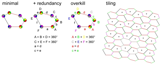
Diagrammatic Illustrations
The minimal (graphics only) version above contains all the information required to define the tiling on the right (plus the information that reflexion is allowed).
Adding some redundancy to the diagram does aid its readability.
That is labelling the vertices (A to F), the edges (a to f) and listing the necessary relations between them (A+B+D = 360°, C+E+F = 360°, a = d and c = e).
Attempting to reinforce the relationships by colour coding the vertices, edges and their labels against each other does not aid readability, it just adds unnecessary visual noise.
The style and aspiration of these diagrams owes something to Oliver Byrne’s 1847
“The First Six Books of THE ELEMENTS OF EUCLID in which Coloured Diagrams and Symbols Are Used Instead of Letters for the Greater Ease of Learners”.
Visual Mathematics
As Marjorie Senechal says in Quasicrystals and Geometry (Senechal 1996) the discovery of quasicrystals has encouraged mathematicians to think visually again. In this respect she also somewhat surprisingly gives credit to Martin Jay’s Downcast Eyes: The Denigration Of Vision In Twentieth-Century French Thought, (Jay 1994).
Here is an example of Xavier Gérard Viennot demonstrating how to do some serious maths visually.
Prejudice Against Diagrams
On the other hand Sun-Joo Shin in the Logical Status of Diagrams (Shin 1994) is concerned that in mathematics, diagrams are not accepted as proofs and that there is a prejudice amongst mathematicians in favour of symbolic manipulation and other linguistic representations.
She suggests that the main obstacle to using diagrams as proofs is their long standing perceived tendency to mislead us in reasoning. For instance if you want to prove something about triangles and accidentally draw an isosceles triangle you might inadvertently use the specific properties of an isosceles triangle in arriving at your proof.
Alternatively a diagram might mislead one into denying a proposition that is true.
If in the figure AB = AD and BC = CD then angle AEB is a right angle. But angle AEB does not look like a right angle so one might erroneously conclude that the proposition is false, rather than that the diagram is wrong.
But as Shin says (Shin 1994) quoting Barwise and Etchemendy
“If we threw out every form of reasoning that could be misapplied by the careless we would have very little left. Mathematical induction for example for example would go”
A Very Short History of Logic Diagrams
Using circles (or closed curves) to represent the classical syllogisms seems to go back at least as far as Ramon Lull (approximately 1232-1315). However it seems that Leonhard Euler, in the eighteenth century, was the first to use circles to represent relations between classes (what are now called sets). His method was improved in the nineteenth century by John Venn and in the twentieth by Charles Peirce and later by A. W. F. Edwards.
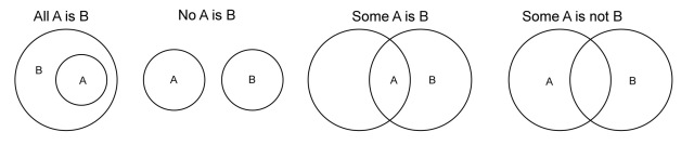
Euler Diagrams
Euler introduced his circles in Lettres à une princess d’ Allemagne (1761) to illustrate syllogistic reasoning. The four types of categorical sentences are represented as follows:-
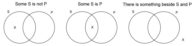
The two universal statements “All A is B” and “No A is B” are represented in an intuitive manner, following the convention that “A” and “B” refer to whole disks.
However there is scope for ambiguity with the existential statements “Some A is B” and “Some A is not B” and interpretation depends on the exact positioning of the labels.
Another problem with Euler Diagrams is that the system does not exhaust all the possible relations between two terms.
A final problem is that the proposition and result are represented in the same diagram so there is no opportunity to start with one proposition and then add another.
However as Martin Gardner points out (Gardner 1982)
“Here [in Euler’s Lettres à une princess d’ Allemagne] for the first time we meet with a geometrical system that will not only represent class statements and syllogisms in a highly isomorphic manner, but can be manipulated for the actual solution of problems in class logic”
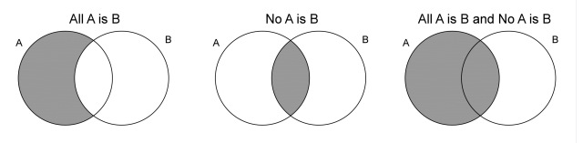
Venn Diagrams
Venn Diagrams overcome most of the problems with Euler Diagrams by having a primary diagram that, influenced by Boolean algebra, labels each compartment in the following way and represents all the possible combinations of class A and class B as follows:-
Unlike in the Euler system, the overlap of the two circles does not represent any specific relation between the two classes. This is added by a separate syntactic device, shading, which is placed in an appropriate compartment.
As Venn expressed it:-
“What we do then is to ascertain what combinations of classes are negatived by any given proposition, and proceed to put some kind of mark against these in the diagram. For this purpose the most effective means is just to shade them out.”
For example the proposition “All A is B” implies that there is nothing in class “A and not B” so this region is shaded:-
Whilst not quite as intuitive as the Euler system this has the advantage that propositions can be combined as required.
Again Venn puts it succinctly
“How widely different this plan is from the old-fashioned Eulerian diagrams will readily be seen. One great advantage consists in the ready way in which it lends itself to the representation of successive increments of knowledge as one proposition after another is taken into account, instead of demanding that we should endeavour to represent the net result of them all at one stroke.”
Venn-Peirce Diagrams
In 1896 Charles S. Peirce invented a system of logical diagrams that he called “Existential Graphs”. Peirce based his system on an examination of what he saw as the four faults of the Venn system (although he continued to call them Euler diagrams).
1. The Venn system “cannot affirm the existence of any description of an object”. As seen earlier Venn’s shading is only capable of representing universal statements.
2. The system “affords no means of expressing a knowledge that one or another of several alternative statements of things occurs.” That is the system is unable to express disjuctive information.
3. “It cannot express enumeration, statistical facts, measurements, or probabilities”. According to Shin, this is no worse than any standard first-order language with existential and universal quantifiers.
4. “It does not extend to the logic of relatives”. That is relations cannot be represented in this system.
In order to represent existential objects, Peirce introduces the character “x” into the system
In order to represent disjunctive information, Peirce does two things. First he replaces Venn’s shading with the letter “o”. He then he suggests the following “rule”. “Connected assertions are made alternately” and introduces a syntactic device to represent disjunction. This is a line that joins “x” or “o” marks.
The right most diagram above conveys the information that is a disjunction of the information that the leftmost diagram conveys and the information that the middle one conveys.
In more complicated cases things are not so simple, in the example above the rightmost diagram conveys the disjunction of the information the two left hand diagrams represent. The effect is to undermine the visual simplicity of the original Venn system.
Peirce suggests a way around this by drawing a Venn diagram of Venn diagrams each surrounded by a circle to represent its Universe of Hypothesis, as above. There is then no need of connecting lines in the enclosing diagrams.
According to Shin this is very similar to the idea behind the disjunctive normal form of symbolic logic.
Peirce then introduces a set of 6 transformation rules for diagrams.
“‘Rule’ is here used in the sense in which we speak of the ‘rules’ of algebra; that is as a permission under strictly defined conditions”
Rule 1: We may erase any entire sign (“o”, “x” or a connected body)
Rule 2: We may connect a character to any other character
Rule 3: Any assertion which could permissively be written, if there were no other assertion, can be written at any time, detachedly. I think this means that we can put in a new piece of information.
Rule 4: When more than one character is written in the same compartment we may transform a diagram in several different ways(i) Characters in the same compartment of the same kind or sign, whether attached or detached are equivalent to one writing of it.(ii) Characters of two different signs(ii-1) Connected signs may be erased since equivalent to no sign at all.(ii-2) Detached signs indicate an absurdity.
(iii) Different kinds of signs connected with other signs say, P and Q. Then we may erase the two contrary signs and connect P and Q.
Rule 5: We may erase a circle.
Rule 6: We may draw a circle.
Here we are a long way from intuitive visual diagrams and Peirce was aware of the shortcomings of his rules.
“These six rules have been written down entirely without preconsideration; and it is probably that they might be simplified and not unlikely that some have been overlooked”
Shin identifies Peirce’s mixing of syntactic and semantic information in rules 1 and 2 as a problem and goes on to develop systems that she calls Venn-I and Venn-II. Neither of these is visually any simpler than Venn-Peirce diagrams.
In quick summary Venn-I uses shading for emptiness, ‘x’ for existential input and connecting lines between ‘x’s for disjoint information. Venn-II is as Venn-I plus connecting lines between diagrams for disjunctive information.
Lambert Diagrams
Lambert published his system in 1764 apparently unaware of Euler’s work. His innovation was to use dotted lines and accurate positioning of labels for the existential statements “Some A is B” and “Some A is not B”.
Lambert represents an individual as a dot and the position of the letter “A” is important. Thus there is at least one thing that is “A” and that thing is represented where the letter “A” is written.
Dotted lines represent uncertainty in the following sense: something else that is “A” might exist, and if it does it can be represented by one of the dots.
Peirce was critical of Lambert for wrongly believing that a sentence or a diagram represents a way of thinking about a fact, not the fact itself.
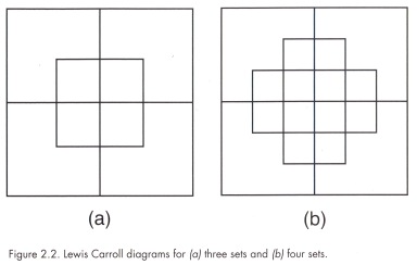
Lewis Carroll Diagrams
Charles Dodgson (Lewis Carroll) was a contemporary of Venn’s and taught mathematics at Christ Church Oxford. He thought that the universal set should be represented not by the whole plane as in Venn’s diagram but by a closed area and that rectangles rather than circles should be used.
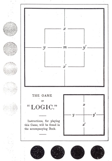
Dodgson used his three set diagram for his Game of Logic, which first appeared in 1887.
But according to A.W.F. Edwards (Edwards 2004) both Venn and Dodgson lost their nerve when it came to diagrams for 5 sets and produced diagrams with disjoint sets.
Edwards-Venn Diagrams
Venn diagrams for 4 and 5 sets redrawn from Venn
As noted above Venn and Carroll Diagrams work well with 2, 3 or even 4 sets but become increasingly difficult to construct for higher numbers.
Edward’s first intuition followed a piece of work on knots by Tait (Tait 1876). If you draw an endless line on a piece of paper so that it cuts itself any number of times (but never cuts itself more than once at the same point), then you can colour the resulting regions using only two colours without any adjoining regions being the same colour, as in the diagram above.
Venn diagrams also possess this property which can be nicely demonstrated by induction.
“Suppose the property holds for a diagram with n sets. Then the closed curve for the set next added, the (n + 1)th, has to pass through each of the 2nregions of the existing diagram. In the new diagram there will be 2n regions inside the new set and 2n outside. Change the colour of each of those inside the new set and the property now holds for a diagram with n + 1 sets, because all the regions which have been divided by the new curve are differently coloured. But it certainly holds for a one-set diagram, so it must hold for any number of sets”.
This is Edward’s redrawing, and correcting, of Peirce’s diagram labelled
“This shows that n closed curves can be drawn so as to separate the plane into just 2n regions no more no less”
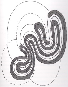
Edward’s next insight was to realise that the problem of higher numbers of sets was simplified if one drew the regions onto a sphere and then projected the result onto the plane.
The method can produce both Venn and Carroll forms of diagram depending upon the orientation of the sphere.
Venn diagram for 9 sets
Once a method was found a minor flood of alternative constructions appeared.
Adelaide is a 7 set symmetric Venn Diagram that A.W.F. Edwards discovered in Adelaide, and was independently discovered by Branko Grünbaum. There are also Hamilton, Massey, Victoria, Palmerston North and Manawatü, all of which are 7 set symmetrical diagrams constructed on a necklace principle and named for the places they were found.
The two colour nature of Venn diagrams means they can even be used to generate binary sequences as above.
Bibliography
Byrne, O. 1847, The First Six Books of THE ELEMENTS OF EUCLID
William Pickering, London
Oechslin, W. 2010, Oliver Byrne Essay on The First Six Books of THE ELEMENTS OF EUCLID Tachen Köln
Senechal, M. (1996) Quasicrystals and Geometry
Cambridge University Press
Jay, M (1994) Downcast Eyes: The Denigration of Vision in Twentieth-Century French Thought
The University of California Press
Shin, Sun-Joo 1994, The Logical Status of Diagrams
Cambridge University Press
Gardner, M (1982) Logic Machines and Diagrams 2d ed
Chicago University Press
Chicago
Edwards, A.W.F. 2004, Cogwheels of the MIND, The Story of Venn Diagrams
John Hopkins University Press
Baltimore and London
Tait, P.G.,1877a On Knots
Transactions of the Royal Society of Edinburgh 28, 145-90
The death of Oscar Niemeyer reminded me of an enjoyable September 2010 visit to Paris with the Twentieth Century Society. Among other wonderful buildings including Pierre Chareau’s Maison de Verre we visited Oscar Niemeyer’s Paris Communist Party Headquarters which later became the French Communist Party Headquarters.
Entrance Under Floating Office Block
Jean Prouvé Designed Ironmongery
Inside The Congress Hall
Detail of Congress Hall Ceiling
The building is being beautifully looked after by the Communist Party and is obviously well loved by its owners and users and a joy to visit.
Design Methods are now so out of fashion that some of its most important documents have recently been thrown out of the Minto House library, including TheDesign Method (Gregory S. A. 1966)
I was trained, 1963-1968, at Sheffield School of Architecture where Geoffrey Broadbent was an influential Lecturer, so was exposed to Design Methods during my architectural education.
The Anatomy of Judgement
In the mid nineteen sixties Jane Abercrombie was a favorite of the Design Methods Movement, she had done research for the Medical Research Council on the best methods of selecting medical students and then gone on to research the best methods of selecting architecture students. The result in both cases supposedly being that no method guaranteed an outcome better than random chance, or sticking a pin in a list of similarly qualified candidates, in those days a somehow satisfactorily democratic conclusion.
If you haven’t noticed something wrong with the image above, look at it carefully again.
Jane Abercrombie was a psychologist and introduced to Design Methods ideas about the importance of visual perception.
“We tend to think of ourselves as passively receiving information from the outside world, but this is far from the case; in the process of receiving information we interpret and judge.”
“When the thing we look at is sufficiently like the thing we expect to see, and easily fits our scheme, our experience helps us to see. It is only when what we expect to see is not there that our schemata lead us astray.”
The book consequently included examples of optical illusions, including the Müller-Lyer and Ames Room illusions. The Müller-Lyer illusion works even when we know the correct answer or that what we are looking at is an illusion.
There is a large amount of literature on this illusion including a discussion in Richard Gregory’s Eye and Brain (Gregory 1978) and some indication that it is culturally dependent on a mainly rectilinear physical environment.
The Anatomy of Judgement also included a line drawing representation of the Ames Room illusion, but it is better appreciated in this modern implementation.
A couple of extra things to note about this illusion.
1) even when you know this is an illusion, there is no way you can switch it off, even if you know exactly how the room is constructed.
2) the architecture over-rides the relation to human scale even with live moving subjects; that is the body is not always the measure.
Abercrombie’s attitude to Design Methods is perhaps best appreciated through this quotation:
“Free group discussion is to thinking (ideas and abstractions) as handling things is to perception.”
Synectics
A perhaps extreme exposition of Design Methods was Synectics (Gordon 1961). The scope of which can be judged from its alternative subtitles, “The development of Creative Potential” and “A new method of directing creative potential to the solution of technical and theoretical problems”.
In spite of a mechanistic reputation its Hypotheses were
i) creative efficiency in people can be markedly increased if they understand the psychological processes by which they operate;
ii) in creative process the emotional component is more important than the intellectual, the irrational more important than the rational;
iii) it is these emotional, irrational elements which can and must be understood in order to increase the probability of success in a problem-solving situation
Apostolic Succession
The acknowledgments section of Synectics includes a certain Dr. Donald Shone, now Schön, who is credited with developing with Gordon the importance of the Hedonic response.
Hedonic response as evoked in creative process takes two forms:
1. It is a pleasurable feeling, developed toward the successful conclusion of a period of problem solving concentration, that signals the conceptual presence of a major new viewpoint which promises to lead to a useful solution.
2. It is a pleasurable feeling which occurs in a minor way acting as a moment-to-moment evaluation of the course of the creative process itself.
Gordon goes on to state:
Emotional response is distrusted in science and technological invention.
This is because the way one feels about the solution to a problem is confused with emotional response to a problem during the process of searching for a solution.
Artists and writers are EXPECTED to like or dislike their materials and subject matter. The products of art and literature are judged on a “like” or “dislike” basis whereas the criterion of technological products is “are they useful?”, “do they work?”
Synectics emphasizes that the PROCESS of producing either aesthetic or technical objects is accompanied by certain useful emotional responses, and that these responses must not be rejected as irrelevant, but must be schooled and liberated.
How to Solve It
A book that I think was influential over the whole field was Pólya “How to Solve It” (Pólya 1945) although its subject was mathematical problem solving, it gives a series of widely applicable problem solving heuristics
Analogy – Can you find an analogous problem that you can solve?
Generalisation – Can you find a more general problem?
Induction – Can you derive a solution by generalising from examples of the problem?
Vary the problem – Can you change the problem to create new problem(s) whose solution(s) will help solve the original problem?
Auxiliary problem – Can you find a sub-problem or side problem whose solution will help solve the problem?
Previously solved – Can you find a related problem that has already been solved?
Specialisation – Can you find a problem more specialized?
Decomposing and Recomposing – Can you decompose the problem and “recombine its elements in some new manner”?
Working Backwards – Can you start with the goal and work backwards to something already known?
Draw a Figure – Can you draw a picture of the problem?
Auxiliary Elements – Can you add some new element to the problem to get closer to a solution?
Bibliography
Ed Gregory S. A. 1966
The Design Method
Butterworths, London
Gregory R. 1978
Eye and Brain The Psychology of Seeing
Third Edition Revised and Updated
World University Press
McGraw Hill Paperpacks
Abercrombie M.L.J. 1960
The Anatomy of Judgement
Hutchinson
Gordon W.J.J. 1961
Synectics
Harper & Row
New York, Evanston and London
Pólya G. 1945
How to Solve It.
Princeton University Press.
Wang tilings seem to me to be visually more interesting than their plain or decorated aperiodic tiling generators. The various versions of the same Penrose P2 tiling below all look very uniform, with their randomness hardly registering, whilst the randomness of their Wang equivalents is much more apparent.
It also seems that the mathematical desire to reduce the number of tiles and colours to a minimum reduces the visual interest of Wang tilings.
The first three Wang tilings below are derived from Penrose P2 and Ammann A2 aperiodic tilings as described in “Wang Tiles and Aperiodic Tiling” where the Culik / Kari method of deriving the fourth tiling is also illustrated.
I am not sure if, in Cecil Belmond’s terms, the second tiling is more “alive” than the first, which is smoother and more evenly distributed. There is a tension in the second tiling caused by adjacent blocks and runs of similar colours that is not present in the first.
It is perhaps worth saying the obvious here, that Wang tiles can be seen as a means of delivering random sets of coloured square tiles because their edge colours have to match, thereby creating coloured squares.
With this in mind it can be seen that Wang tilings bear a close resemblance to a number of artists’ work. The resemblances probably relate to the use of chance in the composition of these works. An early example is Ellsworth Kelly and his “Colors for a large Wall” 1951. Oil on canvas mounted on 64 wood panels; overall 7′ 10¼” x 7′ 10¼”.
Ellsworth Kelly had met John Cage and Merce Cunningham in Paris after the Second World War and the title of the painting below “spectrum colors arranged by chance II” 1951 clearly acknowledges the use of chance.
Bridget Riley has also produced a number similar works. “From Here” 1994 has connected blocks and runs of similar colour, that closely resemble the Wang version of the Ammann A2 24 tiles over 24 colours tiling.
Ignoring their superficial diagonality, Wang tilings also seem to bear a striking similarity to some of Gerhard Richter’s Colour Chart paintings such as his “4900 Colors” of 2007thatuses randomly selected colours and also appears to have clumps and runs of colours as one should expect with a truly random composition method (see “Find Your Own Space”).
Various versions consist of different numbers of panels but Version I consists of 196 panels, each of which consists of 25 squares. Each individual panel is made up of spray-painted enamel squares that measure 9.7 x 9.7 cm.
In architecture Sauerbruch and Hutton’s High Bay Warehouse uses 16,000 25 x 160 cm metal panels in 20 colours.
High Bay Warehouse Dogern: Sauerbruch and Hutton 2002
Dr. Bernhard E. Kallup, Chairman of Sedus Stoll AG, comments: “We offer huge product variety for all potential applications. Our broad portfolio for administration, communication and regeneration scenarios includes millions of technical and visual options, to ensure that no restrictions are put on architects and special building project managers. The warehouse architects have symbolised this freedom in their facade design.”
Scale seems to be an important attribute of this scheme, projects with larger panels and or fewer colours seem much cruder, as in Morrison’s huge warehouse at Bridgewater just off the M5 with its enormous panels in just four colours. It looks much better in this photograph than it does in reality.
Apart from the physical size of the panels I think this relates directly to an understanding of the different number of tiles and colours in the Wang tiling examples above. That is 13 tiles over 5 colours or 16 tiles over 6 colours is too crude and 32 tiles over 16 colours is probably too bland and smooth. Leaving 24 tiles over 24 colours as offering the liveliest set that is not too crude or bland.
Bibliography
Grünbaum B., Shephard G. C. (1987)
Tilings and Patterns
W.H. Freeman and Company
New York
Kari J., 1996
A small aperiodic set of Wang Tiles
Discrete Mathematics Volume 160 Issue 1-3 Pages 259-264
Culik K., 1996
An Aperiodic Set of 13 Wang Tiles
Discrete Mathematics Volume 160 Issue 1-3 Pages 245-251
Belmond C., Smith J. (2007)
Informal, Pages 189-264
Prestel Munich, Berlin, London, New York